Photographic Blog
Composition as part of visual language
Symmetry vs Asymmetry

Symmetrical composition

Nadir

.jpg)
Color 1

Color 3


5 Points of View
Reflection
The first image is strictly symmetrical, with the subject placed in the center, which creates a sense of stability and balance. The viewer’s eye is immediately drawn to the middle of the frame, making the composition feel calm and controlled.
In contrast, the second image is asymmetrical and feels more dynamic. The subject is placed off-center, and the composition follows a more geometric structure, which guides the viewer’s gaze across the frame instead of fixing it in one point. This creates a sense of movement and visual tension, making the image more engaging.

Low angle
Reflection
Photographing the same subject from different points of view clearly changed how it is perceived. Each angle creates a different relationship between the viewer and the subject.
The nadir and low angle shots make the subject appear more dominant and imposing, as the viewer looks up at it. In contrast, the high angle and zenith shots create a more distant and observational feeling, making the subject seem smaller and more vulnerable. The eye-level shot feels the most neutral, as it reflects a natural and direct perspective.
The strongest images are the low angle and high angle shots, as they create a more noticeable shift in perception and emotional impact. The more extreme the angle, the more it changes how the subject is interpreted.
This exercise showed how perspective alone can significantly influence the meaning of an image, even when the subject remains the same.
Color Study
Reflection
Each color palette creates a different mood and changes how the composition is perceived. The green monochromatic setup feels calm and natural, but also the flattest because the similar colors reduce visual separation between the objects. The warm palette creates an energetic and harmonious atmosphere, with the yellow elements standing out naturally against the red background. The cool palette feels fresh and calm while giving more depth through the contrast between light and dark blue tones. The complementary warm and cool composition is the strongest visually, as the opposite colors create clear contrast, make the objects stand out, and add the greatest sense of depth. Overall, I think the complementary composition works best because it is the most eye-catching and balanced.
Outdoor Practice
Reflection
While shooting, I focused on composition by using the rule of thirds and placing subjects near the golden points to guide the viewer’s attention to different areas of the frame. I also experimented with geometric compositions to create a more structured and visually engaging result.
Technically, I adjusted my camera settings to keep the images sharp. I increased the shutter speed and aperture to avoid motion blur and unwanted softness, and compensated with ISO when needed. These decisions helped me maintain clarity while shooting handheld outdoors.
Looking back, I would be more intentional with my compositions instead of relying on general rules. In some cases, the use of the rule of thirds felt mechanical rather than expressive. Next time, I would experiment more with unconventional framing and pay closer attention to how light and composition work together to create a stronger visual impact.
Object Study


Eye level

Asymmetrical composition

Color 2

Color 4


High angle


Zenith


Reflection
The first object caught my attention because of its unusual and slightly strange appearance, especially the details beneath it. I explored it from different angles to emphasize its proportions and structural features, as well as capturing a close-up of the face. The expression appears almost frightened, which adds a sense of character and makes the object more engaging to photograph.
The second object stood out because of the emotion it conveys, as well as its surrounding environment. I approached it by starting with a wider shot to show context, then focused on specific details such as the hands—one of which is holding the hair—and finally moved closer to capture the facial expression and gaze. This progression allowed me to highlight different aspects of the object’s emotional impact.
The strongest images are the close-ups, particularly those focusing on the face and hands, as they communicate emotion more directly and create a stronger visual connection. The wider shots are useful for context but feel less impactful on their own.
Looking back, I would improve the study by being more selective with composition and eliminating weaker frames that do not add new information. I would also experiment more with lighting and background control to better isolate the subject and enhance its visual qualities.
Place Study


Reflection
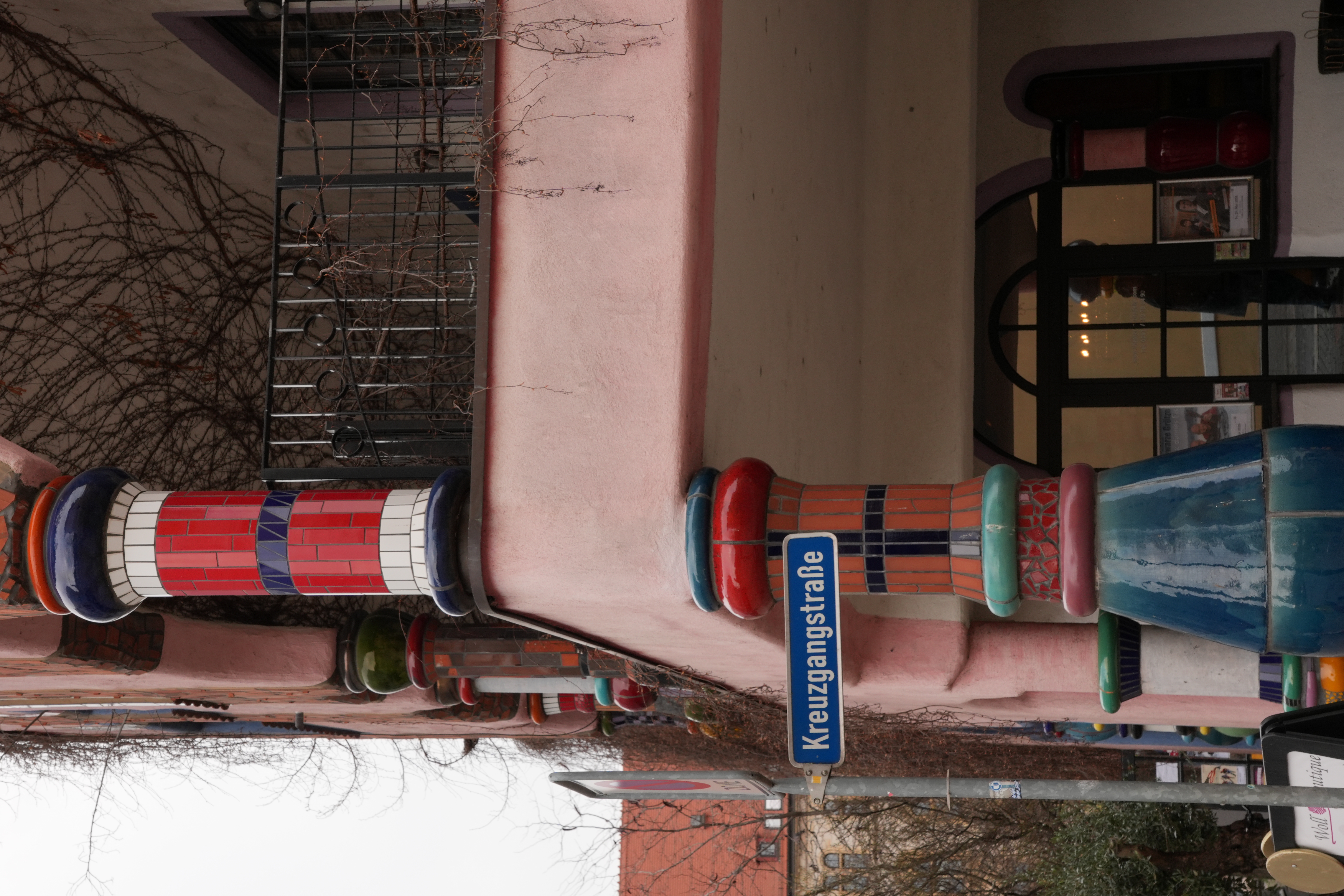
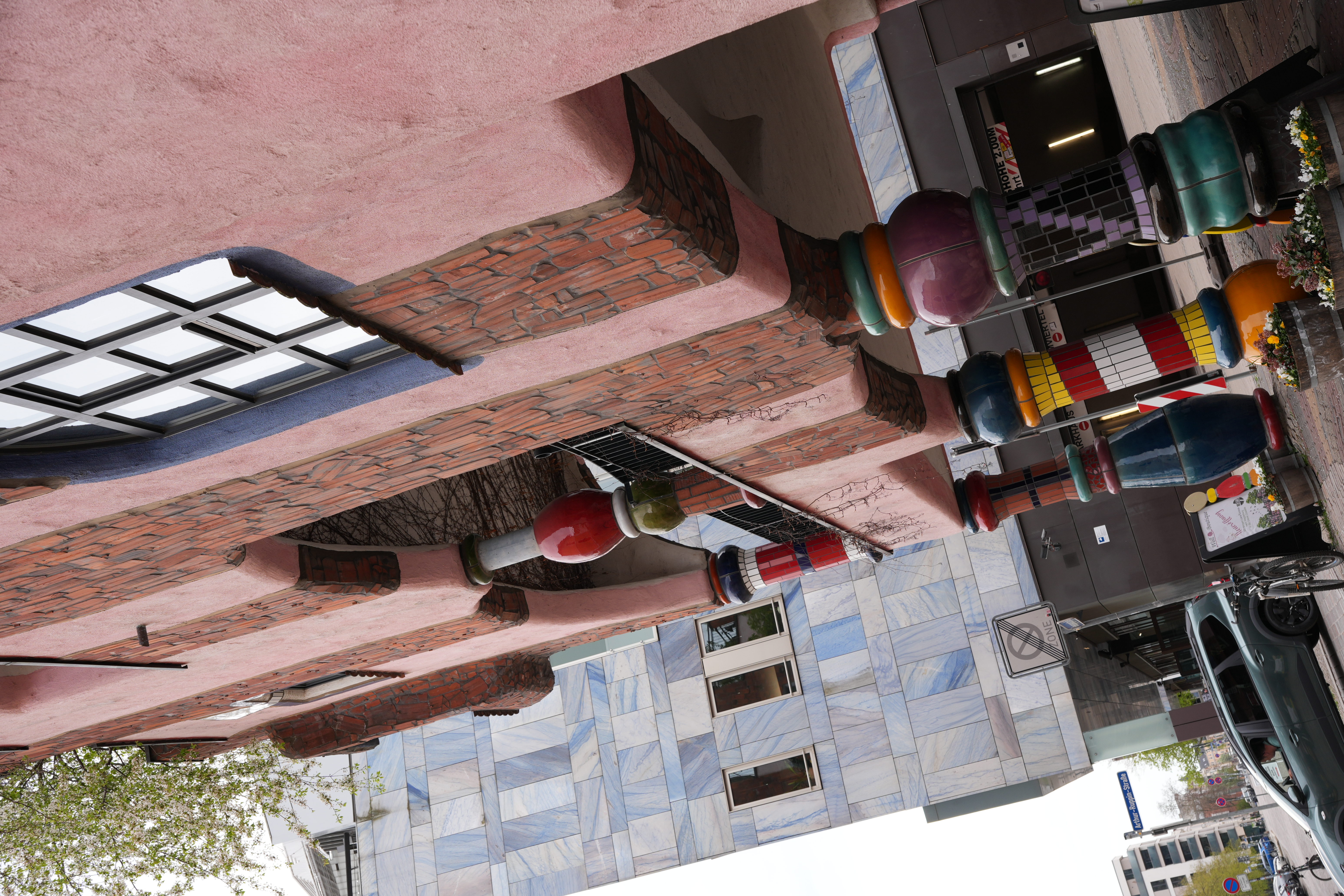
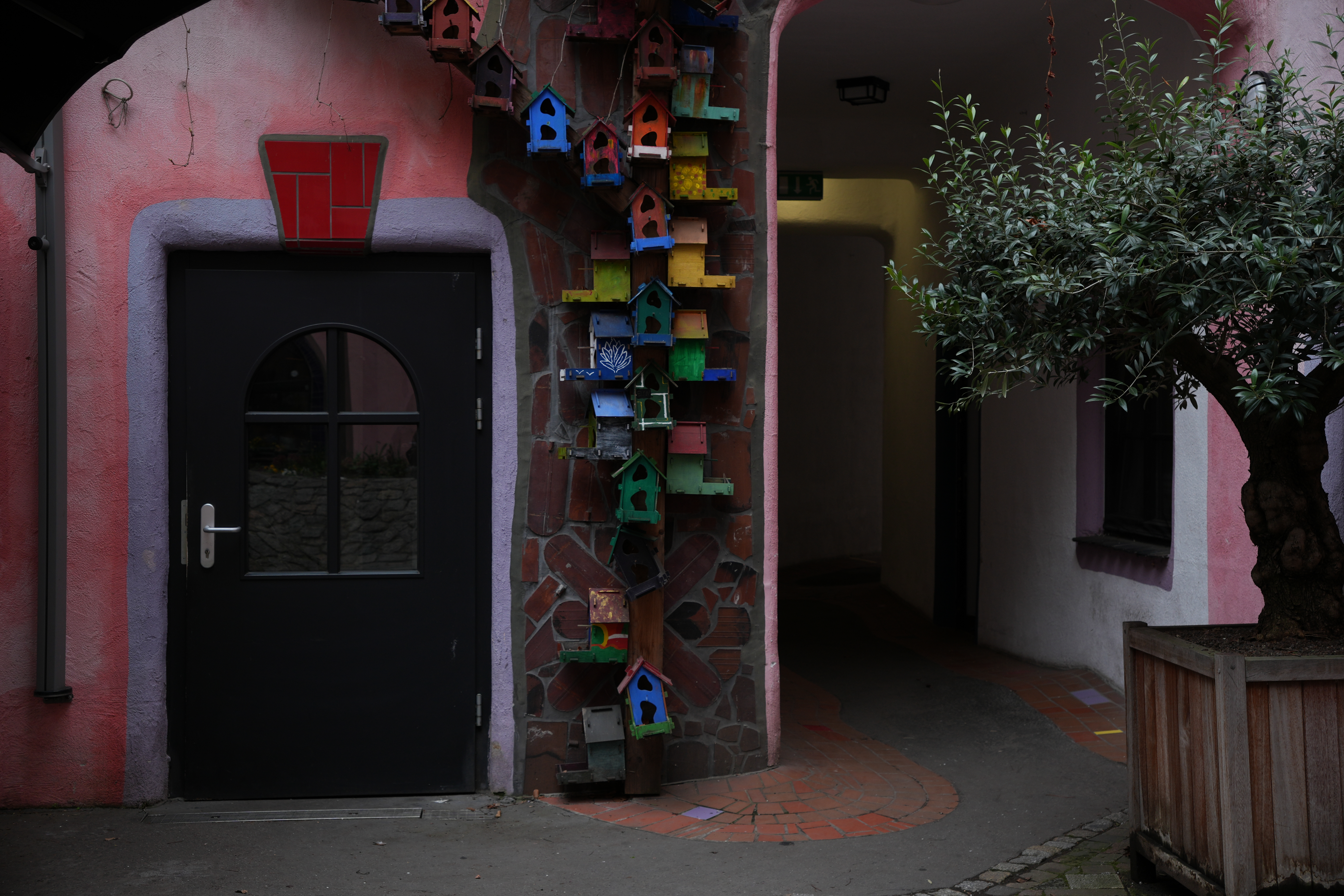
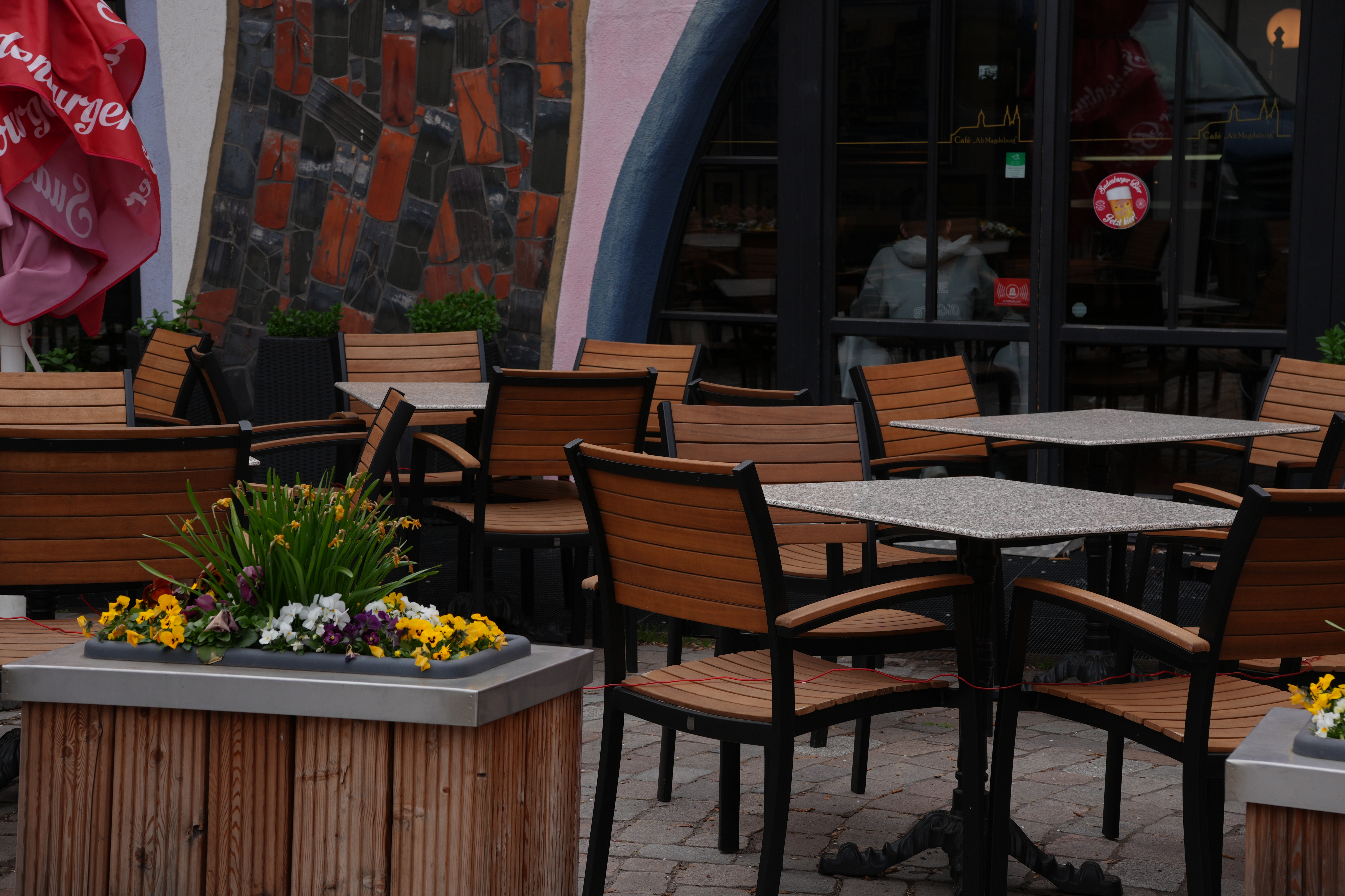
This place is important to me because it reflects my inner emotional state. The variety of colors and details gives it a playful, almost nostalgic atmosphere, similar to a childhood environment. At the same time, it doesn’t feel purely light or simple—it has a deeper, more introspective quality.
In the third image, I approached the scene more metaphorically. The composition suggests a sense of choice or uncertainty, like standing at a point where different paths are possible. The colorful elements and birdhouses reinforce the idea of an “inner child,” while also creating a slightly surreal feeling.
Visually, I tried to express this contrast through both composition and lighting. The images appear bright and colorful at first glance, but the lighting and depth add a more inward, reflective mood rather than something purely cheerful. This combination helped me move beyond simply documenting the place and instead communicate a more personal and emotional interpretation.